

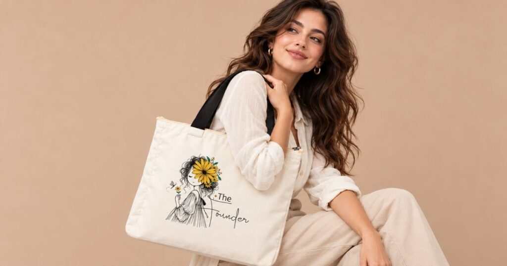


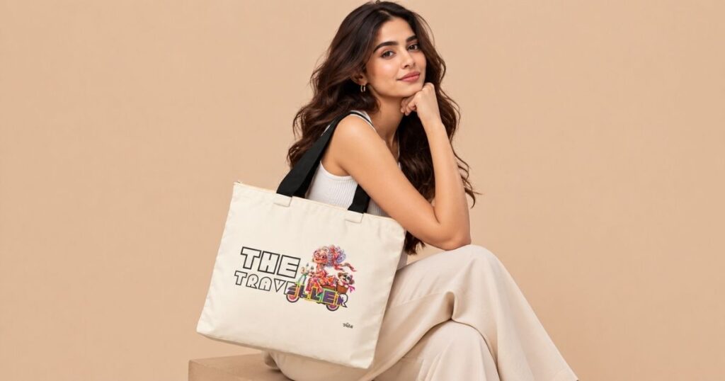


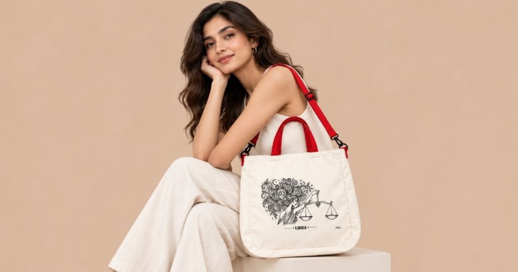
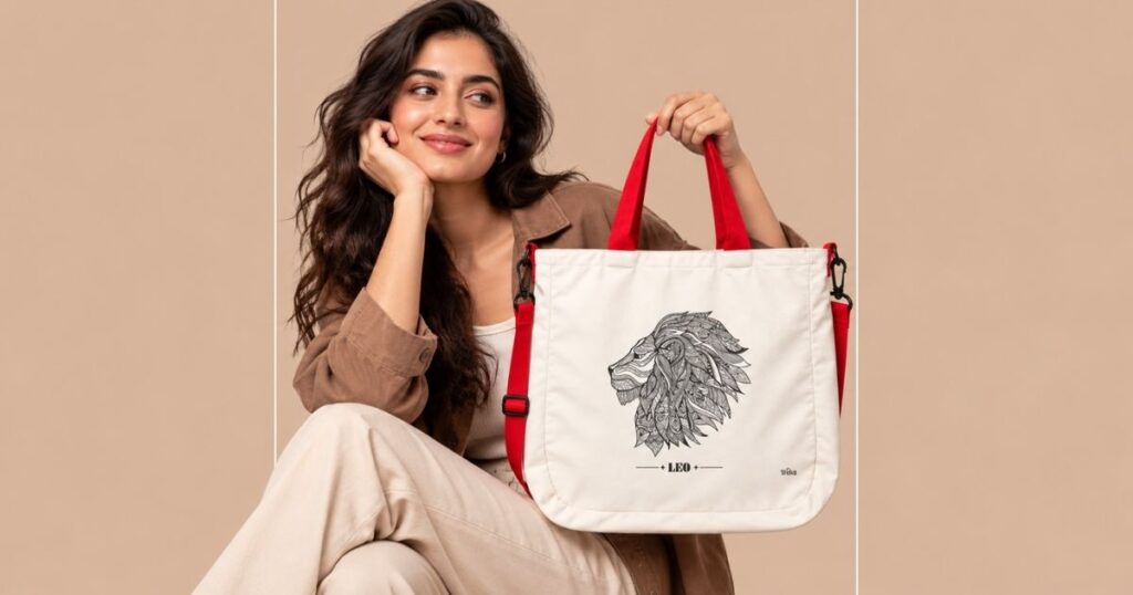

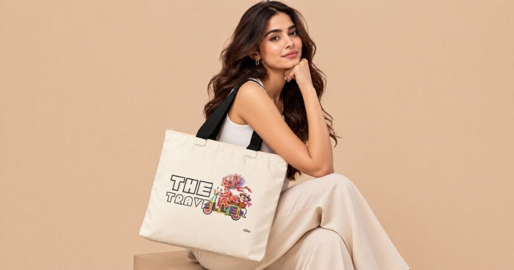













Typography Tote Bags Design and What Makes a Slogan Work


Why Typography Matters So Much on a Bag
People see a tote from a distance, at an angle and often in motion. The text has a fraction of a second to be read and felt. Good typography makes that instant work.
It sets the mood. A heavy, bold font feels confident. A thin, delicate one feels soft. A handwritten one feels personal.
It controls readability. The wrong font at the wrong size turns a powerful line into a blur.
It signals quality. Careful spacing and proportion make a bag look designed rather than printed.
The Building Blocks of Good Typography Tote Bags Design
Font choice
Sans-serif fonts, the kind without little feet at the ends of letters, look modern and clean. Bold sans-serifs read well from across a room, which is why statement bags often use them.
Serif fonts feel more classic and literary, good for quotes from books or poetry.
Script and handwritten fonts feel personal but can be harder to read at a distance. Use them for short words, like a name.
Size and weight
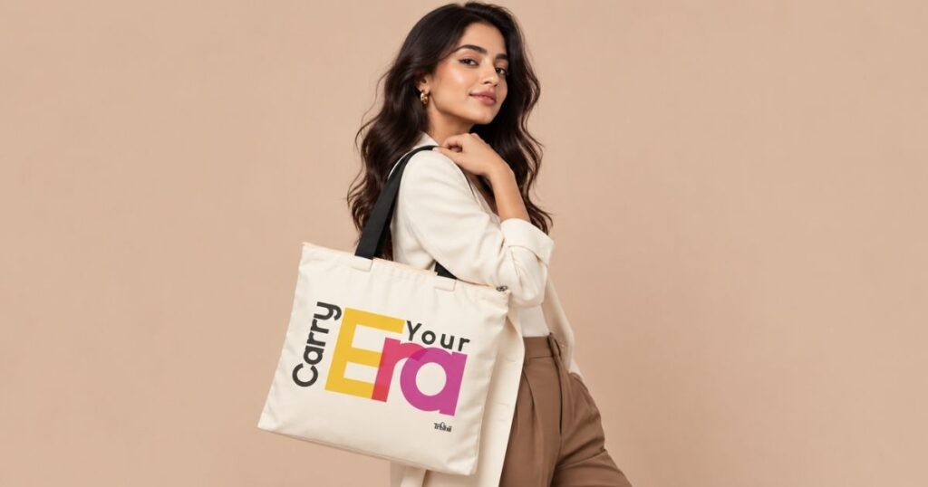
On a statement tote, the text should be big. A line that takes up most of the print area makes an impact. Small text in the middle of a large bag looks lost.
Weight, meaning how thick the letters are, matters too. Bolder letters survive printing and washing better and read more clearly on fabric.
Line breaks
Where you break a line changes how it reads. “Carry Better” on one line and “Carry Bolder” on the next creates rhythm. Breaking in an awkward place, like between “Carry” and “Better”, spoils it.
Spacing
Letter spacing and line spacing need room to breathe. Cramped text looks cheap. Too much space and the words drift apart.
Contrast
Text must stand out from the background. Black on white, white on black, or a strong colour on a neutral base reads best. Pale text on pale fabric disappears.
Placement
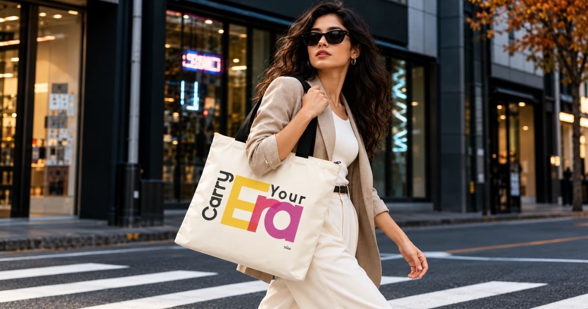
Centred text feels balanced and formal. Text placed lower or to one side can feel more editorial and modern.
Colour choices for typographic bags
The colour of the text should feel connected to the strap and the rest of the bag. A black and white design with a red strap creates a sharp three-colour palette. A single coloured line on a neutral base looks confident. Avoid using three or four different text colours on one bag, since it fights the clarity that makes typography work.
Think about how it will be carried
A tote bags from a shoulder, so text near the top may hide under an arm, and text near the bottom may crease when the bag is full. Placing the main line in the middle third of the print area usually keeps it visible.
How Trishii Approaches It
Trishii describes its Speak Series as a statement-led collection with bold typography, strong messages and minimal front-focused designs. Each tote carries one line, with nothing else competing for attention, printed over an A4-sized area on one side using sublimation printing.
That restraint is a typography choice in itself. One line, one strong typeface, plenty of space.
Designing Your Own Typographic Tote
If you are creating a custom tote, these tips help.
● Keep it short. Aim for two to six words.
● Choose one font. Two at most, one for the main line and one for a small detail.
● Go big and bold. Fill the print area with confidence.
● Check from a distance. Print a draft on paper, stick it on a wall and look at it from across the room.
● Mind the spelling. Typos on a printed bag are permanent.
● Send vector or high-resolution files. Trishii recommends print-ready files such as PNG, PDF or SVG. Vector files like SVG and PDF keep edges sharp at any size.
Trishii reviews each custom design before production and notes that small differences in size, placement or colour can occur depending on the fabric, printing method and artwork quality.
Common mistakes to avoid
Long paragraphs, very thin fonts, low-contrast colours, text too close to the edge, and mixing three or four fonts in one design.
The Takeaway
Typography Tote Bags design is what separates a fashion piece from a promotional freebie. Choose a bold, readable font, size it generously, break lines thoughtfully, give letters room and keep strong contrast. Whether you are buying from Trishii’s Speak Series or designing your own, these basics help you choose a bag that says its words well.
Frequently Asked Questions
Which font is best for tote bags?
Bold sans-serif fonts are easiest to read at a distance and survive printing well. Script fonts suit short words like names.
What file format should I use for a custom text tote?
Trishii recommends high-quality, print-ready files such as PNG, PDF or SVG. Vector formats keep text sharp.
How many words should a slogan Tote Bags have?
Two to six words usually work best for readability and impact.